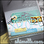
So my layout is based on a style vs. a person. I have seen this kinda of style on a few blogs, but then when I went back to try and find the blogs I could not find a person with this style to show where I am coming from. Tear. Basically, the style is using smaller pictures with lots of layers kinda right on top of each other and then tons of white/negative space. Sometimes a few paint/mist droplets are thrown in as part of this style.
Generally, I have a fear of white space. It's just empty and out there staring at me. I tend to want to fill my pages up. My style I feel is more linear and simple. So I was trying to be full of free layers here. The paper is cream and there are light blue splatters on the page. (This may be hard to see from this post, so I made the picture bigger.) Usually, with smaller pictures like this I want to scrap on a 8X8 page or even a 6X6 in this case (fear of white space), so putting such a small picture on a 12X12 page was new for me. I enjoyed this challenge. It got me outside the box and in the end I kinda like this page.
The picture is me and my husband when we were first dating. Hey, that should be my journaling! For some reason my journaling comes to me a long time after my pages are done. I find this weird because I like to write. I often fill notebooks with my travels or life observations, so I am not sure why a scrapbook page suddenly intimidates me when it comes to journaling. (perhaps looking back at these notebooks would help)
I like the way Shimelle listed "inspiration points" in Challenge one I think I might start doing that with my pages.
Inspiration Points:
- small pictures
- layers
- paint droplets
- white/negative space
- 12X12 pages
- doilies








1 comment:
Great page! I usually don't have that much white space on a page either. I like how you approached the challenge.
Post a Comment